I’ve gotten tired of the default color theme in Excel. As a palette snob, I’ve been wanting a color palette generator based on curve-fitting on a color wheel. The idea is to draw a curve on a color wheel, and sample the points along that curve to generate a smooth palette with natural transitions between hue, lightness, and saturation.
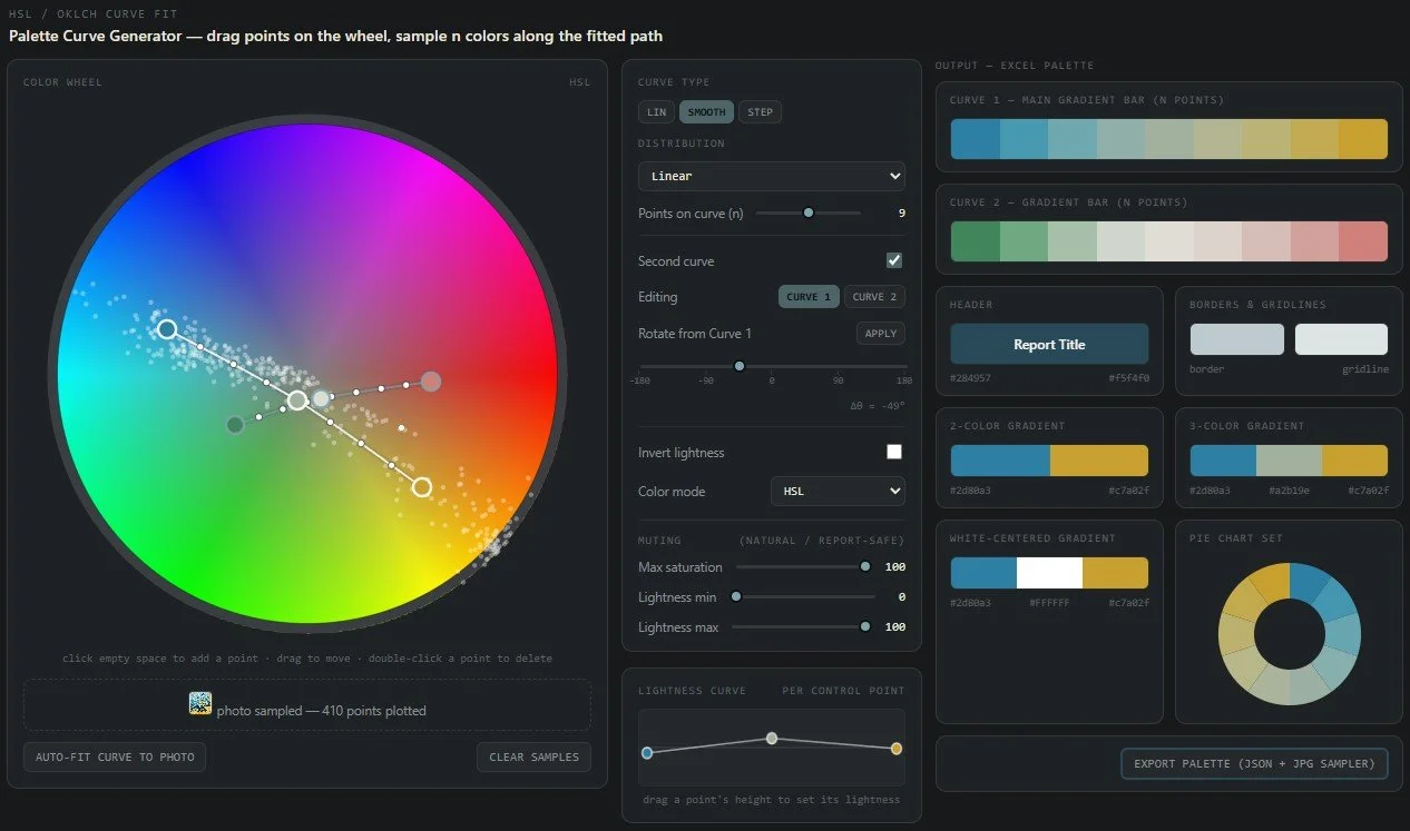
This is an HTML tool drafted with Claude
Sampling Colors from an Image. Drag and drop an image to auto-populate the color wheel with color samples (little white dots). You can then auto-fit a curve to those samples, or adjust it manually.
Two Curves . To generate multiple complimentary palettes, make two curves. This is trickier to find a secondary palette that looks right, but a good starting point is to rotate the first curve 30, 60, or 180 degrees around the color wheel to get a complimentary language.
Gradients. I’m auto-generating a few common color gradients: 2-colors, 3-colors, and a 3-color with white as the default midpoint.
Curve Sampling Types. Linear vs. smooth-curved options, and linear vs. smooth sampling along the curve. The default is a 3-pt curve, but you can add as many as you want.
Export. The script auto-generates a name and exports a palette sample page, and a hex palette JSON file (drag and drop into any LLM to use the palette for any report, Excel, or otherwise). It auto-generates colors for headers, borders, gridlines, gradients, and pie charts.
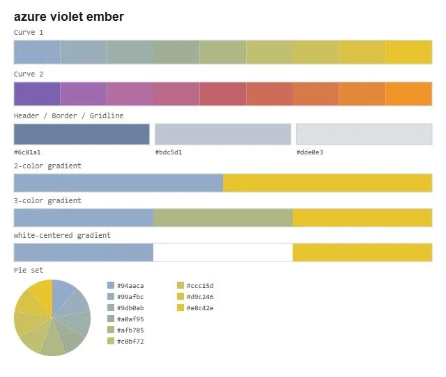
An example of the palette sampler export
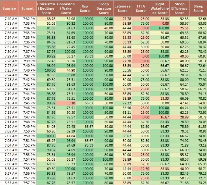
An example of a palette in use for an Excel sleep study. Much preferred to the default conditional formatting gradients.