Life Graphs
Since 2014, I’ve kept a daily log of my life. I record aspects of productivity such as sleep, diet, exercise, socializing, music, work, and learning. This is a way of holding myself accountable and keeping track of what I accomplish each day. It’s become a valuable tool for memory, self-analysis, and an excellent reference for reflecting on the past and planning for the future.

In addition to these productivity metrics, I also record 58 unique feelings, or affective states. These feelings are recorded on a scale of 0 to 10. This is an attempt at a data-driven classification of feelings, rather than thinking of all feelings as being either notionally positive or negative.
Does feeling (x) make me feel good or bad? Does feeling (x) make me more or less productive? Is feeling (x) more strongly associated with one behavior or another? This is a visualization of where each of those 58 feelings fall on a variety of spectra.
Each graph is a scatter plot that shows how strongly each of the 58 feelings are correlated with two other variables. In the first example, I take the top 25% and bottom 25% of days, sorted by overall productivity. I find the difference of the averages of both, and plot that on the X axis. The Y axis is the same process, but for overall happiness.
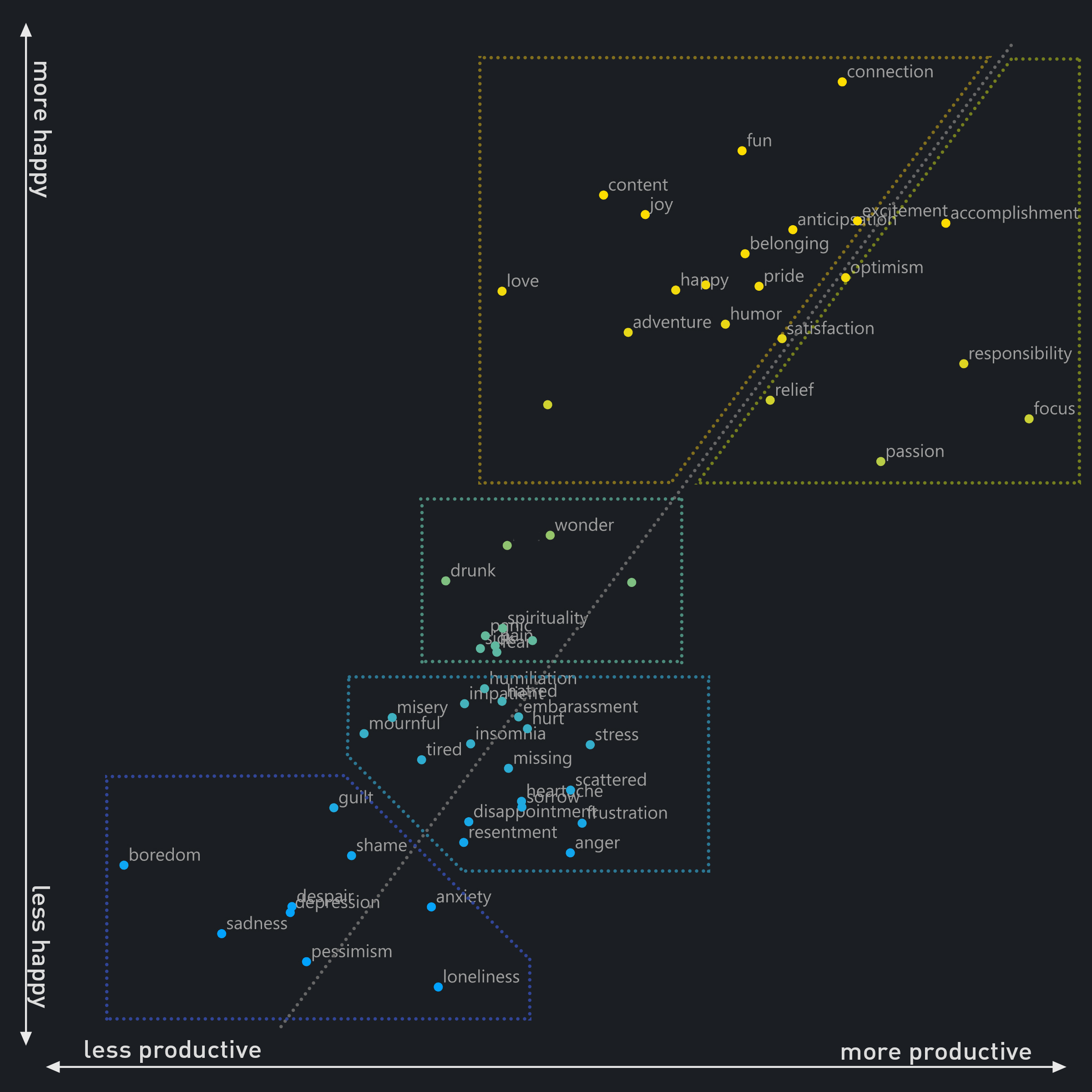
Overall happiness and productivity are probably the most meaningful indicators of how to classify each feeling. There’s a clear positive correlation between the two, and there are distinct clusters of feelings that make sense. In the top right, there’s a cluster (in yellow) of positive feelings associated with productivity (accomplishment, focus, responsibility). The cluster just to the left (in orange) are positive feelings associated with happiness more so than productivity (love, content, joy, fun).
In the middle (green) there’s a cluster of neutral feelings that are not strongly associated with happiness or productivity. These tend to be physical states (drunk, pain), or challenging affective states (fear, wonder, panic). These are some of the most interesting results of this classification. Some feelings in this cluster are typically considered to be subjectively positive or negative, but when considering them purely in terms of productivity and happiness, they aren’t strongly correlated with either.
Towards the bottom is a cluster (light blue) that can be considered mildly negative feelings (frustration, stress, misery, tired). These are clearly on the negative end of the spectrum, but imply that something is being gained by the struggle. These are redeemable negatives.
At the bottom left are the irredeemable negatives (dark blue). These are all bad and no good (loneliness, boredom, despair, depression).
As this is the most intuitive way of sorting these feelings, the colors of these groups are retained for all of the following plots.
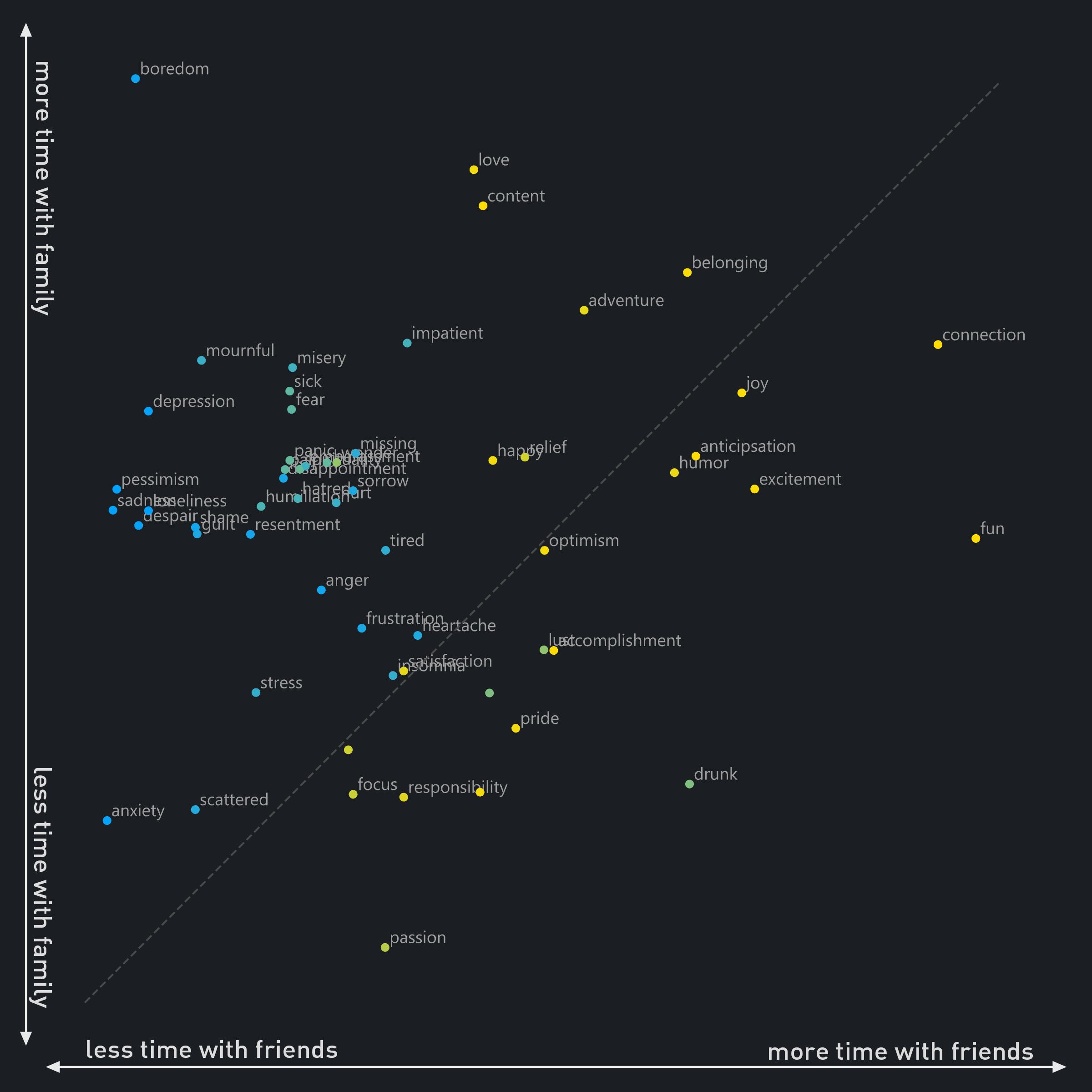
While I think of the productivity/happiness plot to be the most meaningful form of classification, there are countless others that offer insights into the non-intuitive classification of feelings. This plot shows the difference between time with friends and time with family. In the top right half of the plot, it’s clear that more time with both family and friends results in more positive feelings. Some are asymmetrical, such as ‘fun’ being more closely associated with friends and ‘love’ and ‘content’ being more associated with family.

It’s interesting to compare supposed opposites on this plot of school/work. ‘Focus’ would seem to be an opposite of ‘scattered’, but they both appear at the top right, highly correlated with time spent at work or school. It’s amusing that ‘fun’ appears in the very bottom left corner.
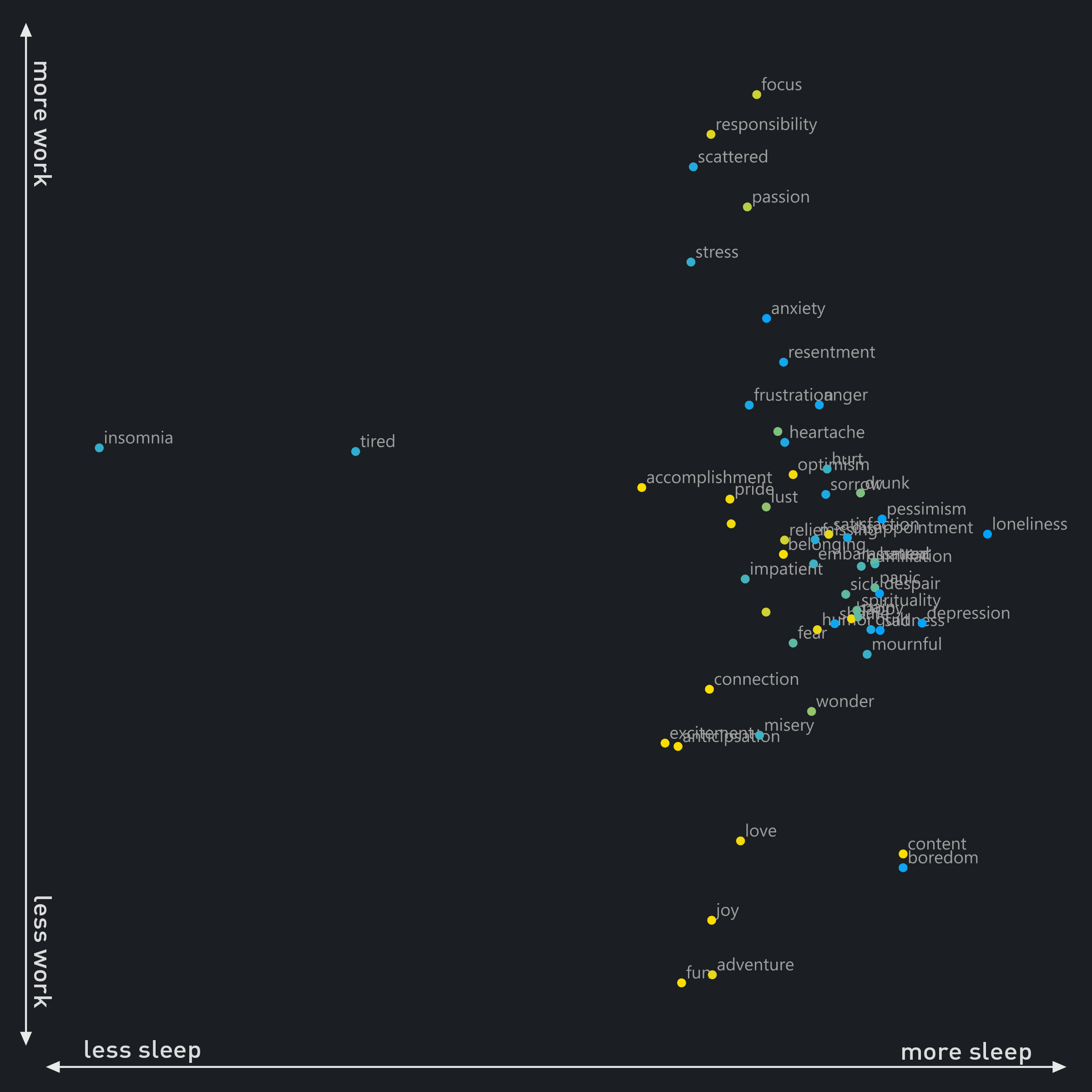
Sleep or work? This may have been an odd pairing. It’s better understood one axis at a time. There are two outliers (insomnia and tired) that are obviously negatively correlated with sleep, but what’s interesting is the cluster of positive feelings appearing around the 75% point of the sleep axis. Accomplishment, love, and adventure are apparently best with plenty of sleep, but not too much sleep. On the far right are the dangers, or results, of oversleeping (loneliness, depression).
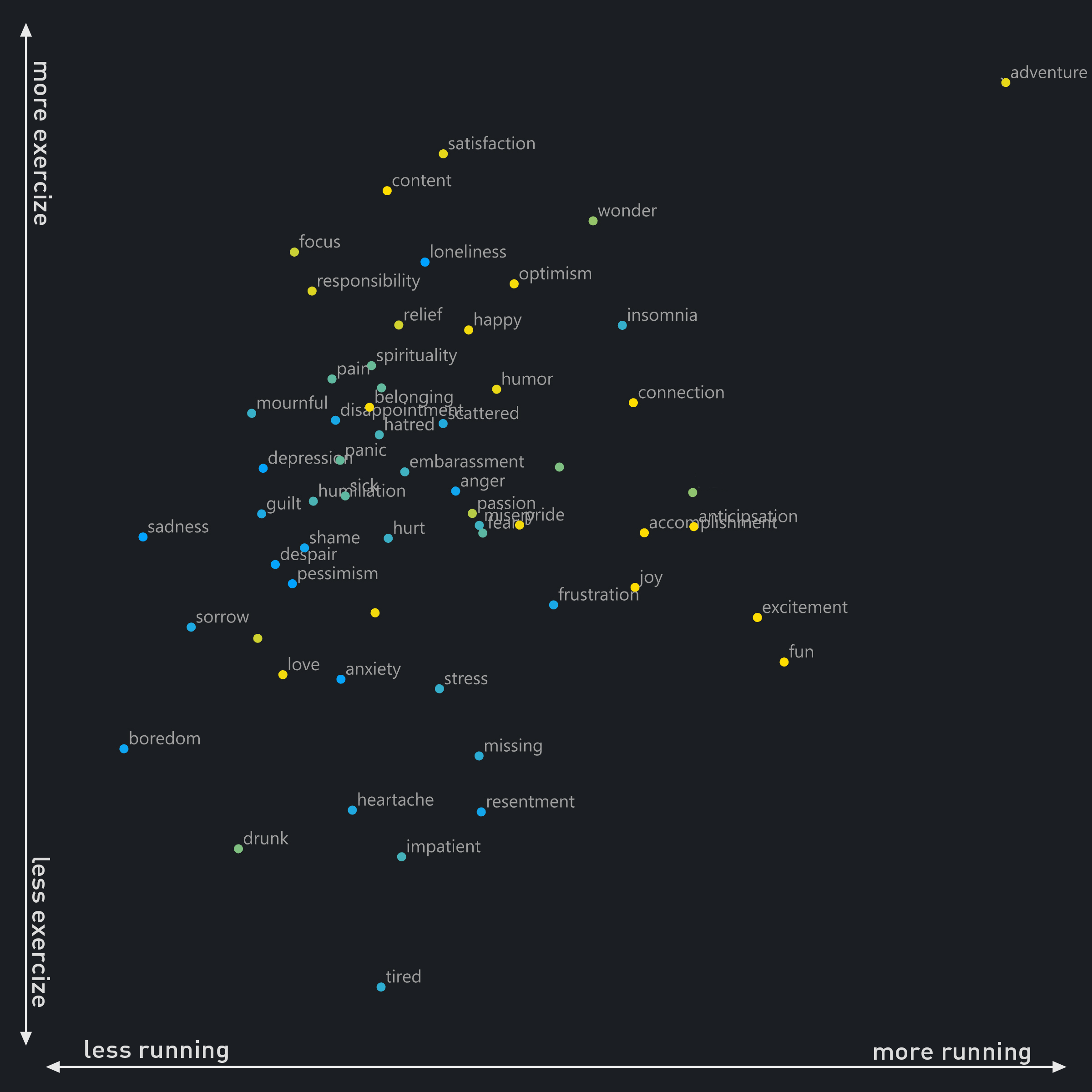
This is a comparison of the benefits of walking or running, versus more stationary exercise. More mileage is associated with fun and excitement rather than focus and responsibility. Notice boredom, drunk, and tired in the bottom left.

This is a plot of calories and water intake, and I’m a little alarmed at how clear these results are. With few exceptions, high calorie intake is strongly correlated with negative feelings (and drinking). It’s hard to interpret causation here. Do I eat more when I feel bad, or do I feel bad because I eat more? It’s likely both. This is good to know.
The correlations with water intake are less obvious at first. I think the top of the plot area is strongly associated with a routine work day, when I have routine water intake, and the bottom of the plot area is associated with travel, when I have less consistent water intake. It’s also interesting to note that most of the green, challenge-based or neutral feelings are also neutral in this plot (with the exception of drinking, which apparently makes me hungry).

I haven’t yet collected a lot of historical climate data, but I do have some regarding temperature and cloud cover. The temperature data may be misleading here, because warm days are related to the daily grind of living in Texas (and probably a few summertime Texan holidays that involve drinking), while the coldest days include enjoyable vacations and winter holidays in cooler climates. The emotional profiles of hot and cold days probably have more to do with my seasonal lifestyle than with the actual temperature.
I was surprised to see how strongly clear skies are correlated with positive feelings. It makes sense, but I didn’t realize I was so affected by sunlight.

Plotting two apparent opposites: loneliness and connection. Again, a similar order appearing with the neutral greens emerging in the middle.

Are optimism and pessimism equal opposites? Apparently there are different types of opposites. For example, connection and loneliness are true, negatively correlated opposites in that the absence of connection is loneliness, and vice versa. But pessimism and optimism are more like mirrored, positively correlated opposites. This is more like a spectrum of strong feelings in the top right, and neutral feelings in the bottom left. ‘Happiness’, as I interpret it, is more like a strong feeling that includes a lot of both optimism and pessimism.

Pride and Joy. This is very similar to the productivity/happiness plot, but more narrowly correlated. Pride and joy could be considered to be peaks of productivity and happiness, so this wedged shape makes sense. They are strongly correlated, but the differences are more apparent at the top right.

Love and happiness are strongly correlated.